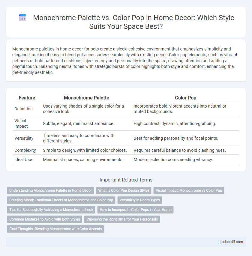
Monochrome palettes in home decor for pets create a sleek, cohesive environment that emphasizes simplicity and elegance, making it easy to blend pet accessories seamlessly with existing decor. Color pop elements, such as vibrant pet beds or bold-patterned cushions, inject energy and personality into the space, drawing attention and adding a playful touch. Balancing neutral tones with strategic bursts of color highlights both style and comfort, enhancing the pet-friendly aesthetic.
Table of Comparison
| Feature | Monochrome Palette | Color Pop |
|---|---|---|
| Definition | Uses varying shades of a single color for a cohesive look. | Incorporates bold, vibrant accents into neutral or muted backgrounds. |
| Visual Impact | Subtle, elegant, minimalist ambiance. | High contrast, dynamic, attention-grabbing. |
| Versatility | Timeless and easy to coordinate with different styles. | Best for adding personality and focal points. |
| Complexity | Simple to design, with limited color choices. | Requires careful balance to avoid clashing hues. |
| Ideal Use | Minimalist spaces, calming environments. | Modern, eclectic rooms needing vibrancy. |
Understanding Monochrome Palette in Home Decor
A monochrome palette in home decor uses varying shades, tints, and tones of a single color to create a cohesive and sophisticated look. This approach emphasizes texture and layering to add depth and visual interest while maintaining a minimalist and elegant atmosphere. Utilizing a monochrome color scheme enhances harmony and balance, making spaces feel calm and organized.
What is Color Pop Design Style?
Color Pop design style emphasizes using vibrant, saturated colors as focal points against neutral or monochrome backgrounds to create visual interest and energy in a space. This approach highlights bold accents such as bright cushions, artwork, or accessories that draw attention and add personality without overwhelming the overall decor. By balancing intense hues with subdued surroundings, Color Pop achieves a dynamic and lively atmosphere tailored to modern and eclectic home interiors.
Visual Impact: Monochrome vs Color Pop
A monochrome palette creates a cohesive and sophisticated visual impact by using varying shades, tints, and textures of a single color, enhancing depth and subtlety in home decor. In contrast, a color pop approach injects vibrant bursts of contrast and energy, drawing immediate attention to featured elements and creating focal points that enliven the space. Both styles leverage color psychology strategically: monochrome evokes calm and unity, while color pop stimulates excitement and dynamism.
Creating Mood: Emotional Effects of Monochrome and Color Pop
A monochrome palette creates a calm, cohesive atmosphere by using varying shades of a single color, promoting relaxation and minimalism in home decor. In contrast, a color pop introduces vibrant, contrasting hues that energize a space and draw attention to specific design elements, fostering excitement and creativity. Balancing these approaches enhances emotional ambiance, influencing mood from serene and soothing to dynamic and stimulating.
Versatility in Room Types
A monochrome palette offers exceptional versatility across various room types by creating a cohesive and calming environment that adapts easily to both minimalist and classic styles. Color pop accents bring dynamic energy and focal points, ideal for accentuating specific areas in living rooms, kitchens, or bedrooms without overwhelming the overall design. Combining these approaches allows for flexible decor solutions that can be tailored to personal tastes and changing trends.
Tips for Successfully Achieving a Monochrome Look
Achieving a monochrome look in home decor requires selecting a single color and incorporating various shades, textures, and finishes to add depth and interest without overwhelming the space. Utilize different materials such as matte, glossy, and soft fabrics to create a balanced and sophisticated ambiance. Focus on layering elements like rugs, cushions, and artwork within the chosen color palette to enhance visual appeal and cohesion in the room.
How to Incorporate Color Pops in Your Home
Incorporate color pops in your home by selecting vibrant accent pieces such as cushions, rugs, or artwork against a monochrome palette of grays or whites to create visual interest. Strategic placement of bold colors like emerald green, mustard yellow, or deep blue adds dimension without overwhelming the space. Use color pops in small doses to highlight architectural features or furniture, enhancing the overall ambiance with contrast and energy.
Common Mistakes to Avoid with Both Styles
Monochrome palette designs often suffer from a lack of contrast, making spaces appear flat and uninviting, so it's crucial to incorporate varying textures and shades within the same color family to add depth. Color pop decor frequently falls into the trap of overuse, overpowering the room and disrupting visual harmony; limiting accent colors to one or two strategic spots ensures balance and cohesion. Both styles benefit from careful planning regarding furniture and accessory placement to avoid clutter and maintain a polished, intentional aesthetic.
Choosing the Right Style for Your Personality
Selecting a monochrome palette emphasizes sleek minimalism and subtle elegance, perfect for those who value simplicity and a cohesive, calm environment. In contrast, incorporating a color pop injects vibrancy and energy, reflecting a bold, creative personality that thrives on visual interest and dynamic contrasts. Understanding your lifestyle and emotional response to color schemes helps tailor your home decor to authentically represent your unique character.
Final Thoughts: Blending Monochrome with Color Accents
Blending a monochrome palette with vibrant color accents creates a sophisticated yet dynamic home decor style that balances simplicity with visual interest. Using neutral tones as the foundation allows bold hues to stand out, enhancing focal points without overwhelming the space. This strategic contrast elevates rooms by combining the timeless elegance of monochrome with the energetic appeal of color pops.
Monochrome Palette vs Color Pop Infographic

 productdif.com